Multiple Linear Regression
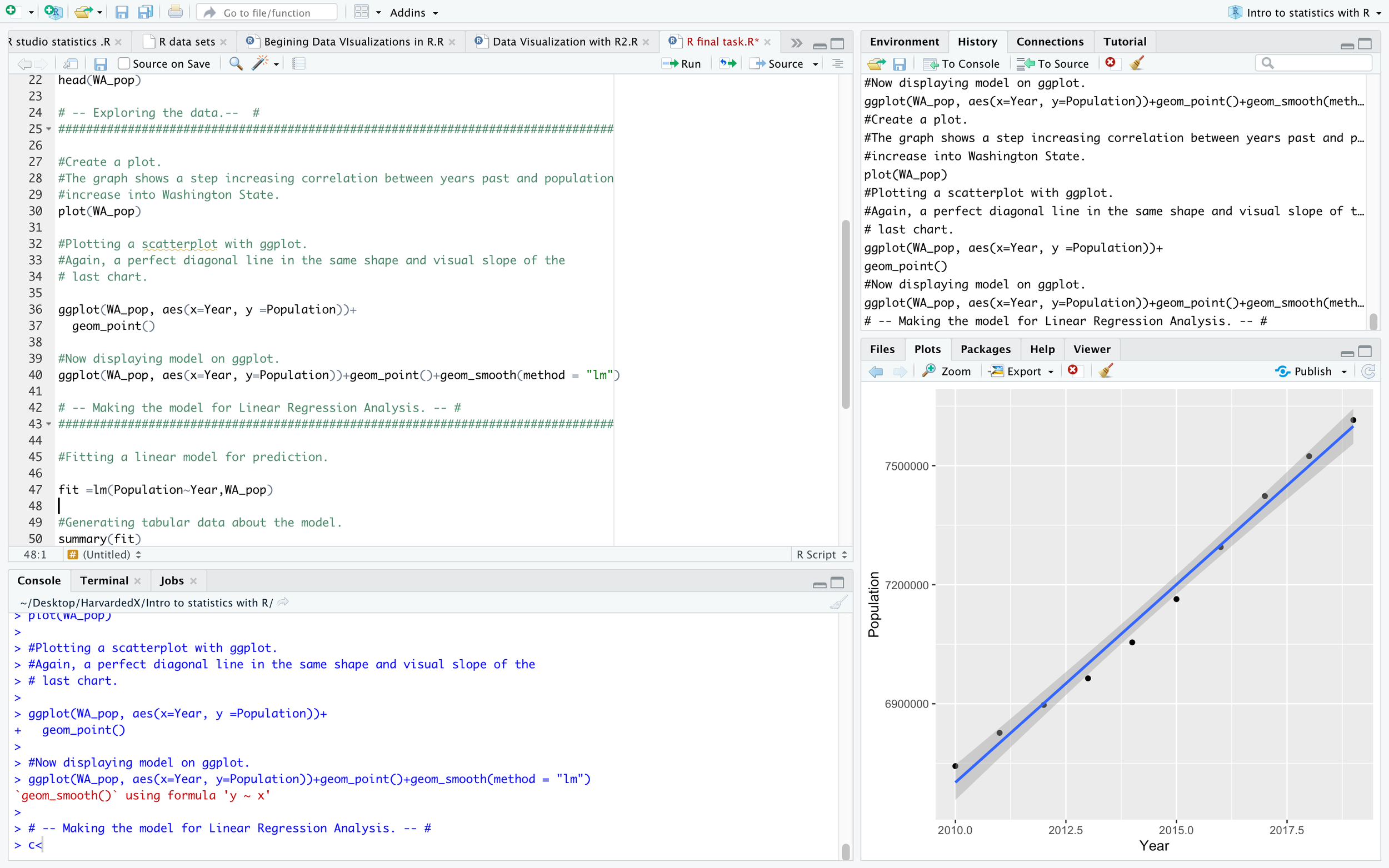
The following screenshots show the building of the predictive model for the state of Washington population:
In this screen shot I imported the needed libraries, the data set as “WA_pop”, and displayed the dataset in the head(WA_pop) located on line 19.
The following screenshot shows, the output of my prediction model in the “Console” screen, located on the lower left corner. In this case, the model predicted that 8,697,014 people will live in the state of Washington by 2035.
Since the dataset was originally held in an excel file named “nst -est2019-alldata()”. Data from all fifty states was located on it as well as other data that did not apply. I copied the applicable data only relevant to Washington State. Then pasted it in a new csv file called “WashingtonStatePopulation2019.csv”. The data was easy to prepare because it was a small amount, ten years, one variable, and no “Null” or “N/A” values. I structured the dataset in excel as two columns and 11 rows with “Year” then “Population” at two column headings.
I imported the dataset as a variable called “WA_pop” into R studio with the read.csv() function which reads csv files from the indicated file directory path; located on line 15 in the upper left-hand screen of the following screenshot. Then I was able to ensure that csv file displayed by using the head() function on line 19. The head() function will display a limited number of columns and rows if the , which means the dataset compiled into Rstudio (rdocumenation.org).
I began to further prepare the data by exploring the relationships between the two variables “Year” and “Population” as a ggplot visualization. The grey grid graph visualization displays the dots positively correlated between Year and Population with a blue line of best fit running though the dots. The code for this graph is located on line 36 of the script section and is displayed in console in the lower left. The blue line is generated by the code “ + geom_smooth(method = “lm”)”, as per the graphs in the lower right corner in the three previous screen shots. The following plot in the screenshot in the lower right corner is generated from the code on line 26, “plot(WA_pop)”. This graph shows the same positive correlation between the variables. Line 32 provides the same graph only with black dots and grey gridded graph in the background provided by ggplot. Line 36 then places the blue line of best fit.
At line 43 in the following screenshot, is a variable labeled “fit” set equal to a linear model Population as a function of Year in “WA_pop” dataset. Next, the summary() function was applied to “fit” object which yielded the Residuals, Coefficients necessary to conduct manual calculations, and the R squared of 98.97% accuracy. Amongst other things, the F-statistic, degrees of freedom, and p-value are products of the summary() function (Linear Regression).
In order to make prediction with the linear model, I created a variable, “new_year” on line 59 in the script window of the following screenshot. I set “new_year” variable to a data frame with one value, “Year =2025”. This was done for a Washington State population prediction five years from 2020. Then on line 60, I called the predict() function, which generates predictions using a model and a variable (Linear Regression). Nested within the predict() function was the linear model “fit” from line 47 and the “new_year” variable. The prediction was 8,198,161 million people will live in Washington State by year 2025.


