

Kmeans Clustering with PCA
Bottom Line Up Front: Customers can be identified by one of two clusters.
A telecommunications company wants to explore it’s a dataset about its customers in order maximize company operations. The intent of this data analysis is to discover insight on how its customers are clustered. With this information, the company can then create more data driven decisions to maximize its Return on Investment for all company activities. The given dataset was cleaned, explored, transformed, and applied kmeans clustering. One question for this analysis being: How many groups can the customers be sectioned into? The result of the cluster analysis is visualized via graphs and the processed documented.
One goal for this analysis is to define the amount of groups by using the variables: 'Lat','Lng','Population','Children','Age','Income','Outage_sec_perweek', 'Email', 'Contacts', 'Yearly_equip_failure', and 'Tenure'. By identifying these continuous variables and these groups, I can identify them by a specific cluster number. K-means clustering is an unsupervised machine learning algorithm that classifies and groups ‘like’ variables. When populating a scatterplot of datapoints, it may be visually apparent how many distinct groups there are; sometimes not. Therefore, the user must define the number ‘k’ of clusters as points to be randomly plotted in the scatterplot. The number of clusters centroids are plotted and distances to all data points are measured. Next, a process called fitting and transforming, where the centroids are serially readjusted or moved to the ideal center of the cluster. Finally, the average distances are minimized until ‘k’ defined centroids are at the optimal center point to all the points defined in their clusters.
Now, fitted and transformed, a random unlabeled data point can be plotted and predicted as to which cluster it may belong. Elaborating the k-means process is towardsdatascience.com, “Step 1, Specify number of clusters K. Step 2, Initialize centroids by first shuffling the dataset and then randomly selecting K data points for the centroids without replacement. Step3, Keep iterating until there is no change to the centroids. i.e assignment of data points to clusters isn’t changing. Step 4, Compute the sum of the squared distance between data points and all centroids. Step 5, Assign each data point to the closest cluster (centroid). Step6, Compute the centroids for the clusters by taking the average of all data points that belong to each cluster” (2021). Moreover, one assumption of K means is that humans must assume the ideal number of clusters based off hasty methods; The same assumption is also a limitation.
A handy package that facilitates this analysis is sklearn, because it is great statistical library and one-stop-shop for all functions required for this assignment. With sklearn, we can import the preprocessing method for scaling the data. Sklearn also has Principal Component Analysis (PCA), that can be imported to reduce the dimensionality of the dataset via the decomposition method. PCA reduces the complexity of the dataset for faster computation times. Most importantly, sklearn has a cluster method, the KMeans function, that can be called; Saving a lot of time an code. The pandas and numpy libraries are necessary for quickly manipulating large datasets. Additionally, matplotlib and seaborn libraries are great visualization tools for this analysis because they are easy to implement and helpful for data exploration.
Each of the steps to clean the data are as follows: First import the dataset and drop the null values. Next separating the continuous variables from categorical and explore the continuous variables in a correlation matrix. Third is to drop all unnecessary or correlated variables and scale the data. Fourth, PCA is then conducted to reduce the dimensionality of the variables and extract features into Principal Components. From that point, the PCs are explored for individual and cumulative variance; Unnecessary PCs may be dropped. Fifth, the number of ‘k’ clusters will be determined via the elbow method. Then the kmeans function will be called with the number of clusters predetermined by the Elbow plot analysis. Lastly, the scaled and transformed datapoints will be plotted on a scatterplot to visually analysis the effect of the patterns of clusters when trying different numbers of ‘k’.
Below is a copy of the code to used for this kmeans analysis:
#--Importing necessary libraries --#import sklearnimport pandas as pdfrom sklearn.preprocessing import(StandardScaler, LabelEncoder)from sklearn.decomposition import PCAimport matplotlib.pyplot as pltimport numpy as npimport seaborn as snsfrom sklearn.cluster import KMeans #-- Importing the dataset and exploring the types --#df_raw = pd.read_csv("/Users/lindasegalini/Desktop/WGU/New Program/D212 Advanced Data Mining/churn_clean.csv")df_raw.dtypes #-- Dropping the null values --#df_raw.dropna()df_raw.shape#-- Separating the continuous variables and exploring for correlation. --#str_list = [] #-- empty list to contain columns with strings (words)for colname, colvalue in df_raw.iteritems(): if type(colvalue[1]) == str: str_list.append(colname)#-- Get to the numeric columns by inversion--# num_list = df_raw.columns.difference(str_list) teleco_num = df_raw[num_list]teleco_num.head()#-- Exploring for correlations between varaibles with matplotlib --#f, ax = plt.subplots(figsize=(12, 10))plt.title('Pearson Correlation of Customer Features') # Draw the heatmap using seabornsns.heatmap(teleco_num.astype(float).corr(),linewidths=0.25,vmax=1.0, square=True, cmap="YlGnBu", linecolor='black', annot=True) Output:

#-- Creating a new data frame with the continuous variables minus Questionnaire items and Bandwidth_GB_Year--#teleco_lean = teleco_num.drop(['Item1', 'Item2','Item3','Item3','Item4','Item5', 'Item6','Item7','Item8', 'Bandwidth_GB_Year','CaseOrder'], axis =1)teleco_lean#-- Scaling the data --##-- Create the object --#scaler = StandardScaler() #-- Calculate the mean and Standard deviation --#scaler.fit(teleco_lean)teleco_scaled = scaler.transform(teleco_lean)#-- Conducting PCA --##-- Calculating Eigenvectors and eigenvalues of Cov matrix --#mean_vec = np.mean(teleco_scaled, axis=0)cov_mat = np.cov(teleco_scaled.T)eig_vals, eig_vecs = np.linalg.eig(cov_mat)#-- Create a list of (eigenvalue, eigenvector) tuples --#eig_pairs = [ (np.abs(eig_vals[i]),eig_vecs[:,i]) for i in range(len(eig_vals))] #-- Sort from high to low --#eig_pairs.sort(key = lambda x: x[0], reverse= True) #-- Calculation of Explained Variance from the eigenvalues --#tot = sum(eig_vals)#-- Individual explained variance --#var_exp = [(i/tot)*100 for i in sorted(eig_vals, reverse=True)] #-- Cumulative explained variance --#cum_var_exp = np.cumsum(var_exp) #-- Plot out the variances superimposed --#plt.figure(figsize=(10, 5))plt.bar(range(len(var_exp)), var_exp, alpha=0.3333, align='center', label='individual explained variance', color = 'g')plt.step(range(len(cum_var_exp)), cum_var_exp, where='mid',label='cumulative explained variance')plt.ylabel('Explained variance ratio')plt.xlabel('Principal components')plt.legend(loc='best')plt.show()Output: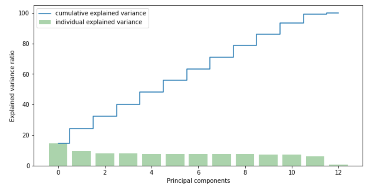
According to 365datascience.com , “n_init is the number of times of running the kmeans with different centroid’s initialization. The result of the best one will be reported The default of ‘init’ is k-means++ which is supposed to yield a better results than just random initialization of centroids” (2020).
#-- Determining the number of clusters with the Elbow Method --##-- Kmeans clustering with PCA --#wcss = [] #-- sum of squares of distances of datapoints --#for i in range(1,13): kmeans_pca = KMeans(n_clusters = i, init = 'k-means++',random_state = 42) kmeans_pca.fit(teleco_scaled) wcss.append(kmeans_pca.inertia_) #-- Now plotting the Elbow Graph --#plt.figure(figsize = (20,20))plt.plot(range(1,13), wcss, marker ='o', linestyle ='--')plt.xlabel('Number of Clusters')plt.ylabel('WCSS')plt.title('K-means with PCA clustering ')

#-- It appears that the most distinct “Elbow” is at point two, then all other points gradually slope from there --#
#-- Exploring how the data clusters when transformed with PCA and ‘k’ =1 --#
pca = PCA(n_components=12)
pca_kmeans = pca.fit_transform(teleco_scaled)
plt.figure(figsize = (9,7))
plt.scatter(pca_kmeans[:,0],pca_kmeans[:,1], c='goldenrod',alpha=0.5)
plt.ylim(-10,30)
plt.show()

#-- Now running KMeans with 2 clusters --#
kmeans_pca = KMeans(n_clusters =2, init = 'k-means++', random_state = 42)
#-- Kmeans with two clusters --#
#-- Compute cluster centers by fitting the data to the model and predict cluster indices --#
X_clustered = kmeans_pca.fit_predict(pca_kmeans)
#-- Define our own color map--#
LABEL_COLOR_MAP = {0 : 'r',1 : 'g',2 : 'b'}
label_color = [LABEL_COLOR_MAP[l] for l in X_clustered]
# Plot the scatter digram
plt.figure(figsize = (7,7))
plt.scatter(pca_kmeans[:,0],pca_kmeans[:,2], c= label_color, alpha=0.5)
plt.show()
Output:

#-- It appears that the cut off is the zero point --#
#-- Now setting 'k' = 3 clusters --#
kmeans = KMeans(n_clusters=3)
# Compute cluster centers and predict cluster indices
X_clustered = kmeans.fit_predict(pca_kmeans)
#-- Define the color map --#
LABEL_COLOR_MAP = {0 : 'r',1 : 'g',2 : 'b',3:'y'}
label_color = [LABEL_COLOR_MAP[l] for l in X_clustered]
#-- Plot the scatter digram --#
plt.figure(figsize = (7,7))
plt.scatter(pca_kmeans[:,0],pca_kmeans[:,3], c= label_color, alpha=0.5)
plt.show()
Output:

#-- Now setting 'k' to 4 clusters --#
kmeans = KMeans(n_clusters=4)
#-- Compute cluster centers and predict cluster indices --#
X_clustered = kmeans.fit_predict(pca_kmeans)
#-- Define the color map --#
LABEL_COLOR_MAP = {0 : 'r',1 : 'g',2 : 'b',3:'y'}
label_color = [LABEL_COLOR_MAP[l] for l in X_clustered]
#-- Plot the scatter diagram --#
plt.figure(figsize = (7,7))
plt.scatter(pca_kmeans[:,0],pca_kmeans[:,4], c= label_color, alpha=0.5)
plt.show()
Output:

#-- Now creating a data frame with the original features and adding the PCA scores and assigned clusters for each row --df_scaled_pca_kmeans = pd.concat([teleco_lean,pd.DataFrame(pca_kmeans)], axis = 1)df_scaled_pca_kmeans.columns.values[-3:] = ['Component1', 'Component2','Component3'] #'Component4','Component5', 'Component6','Component7', 'Component8','Component9', 'Component10','Component11', 'Component12'] #-- The last columns contains the PCA - Kmeans clustering labels per datapiont--# df_scaled_pca_kmeans['Segment K-means PCA'] = kmeans_pca.labels_df_scaled_pca_kmeans['Segment'] = df_scaled_pca_kmeans['Segment K-means PCA'].map({0:'first', 1: 'Second'})df_scaled_pca_kmeans.head()Output:
In final analysis, do the results answer the questions or align with the goal?, Yes, the results seem to be narrowed down. However, the accuracy of the Elbow Technique is limited to human judgement as to what cluster number corresponds with the “Elbow” of the graph. The data is showing that that datapoints are distinctly one of two clusters. With the provided dataset and after kmeans, it appears that the preferred number ‘k’ is two. Moreover, there are two distinct types of ‘like’ data, that would be “int64” and “float”. Upon further exploring the data distributions of the first 3 PCs, exposed the bimodal nature. It also appears that the bimodal nature boils down to either a positive or negative number. A course of action is two explore the relationship between these two clusters and other customer data.
Work Cited:
Dabbura, I. (2020, August 10). K-means clustering: Algorithm, applications, evaluation methods, and drawbacks. Medium. Retrieved August 1, 2022, from https://towardsdatascience.com/k-means-clustering-algorithm-applications-evaluation-methods-and-drawbacks-aa03e644b48a
How to combine PCA and K-means clustering in python? 365 Data Science. (2021, July 29). Retrieved August 1, 2022, from https://365datascience.com/tutorials/python-tutorials/pca-k-means/